

Overview
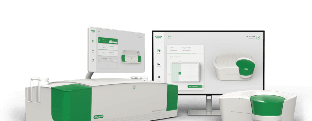
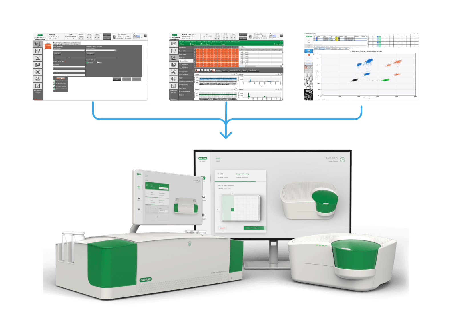
At the start of the pandemic, I led a project with Bio-Rad, merging three DDPCR systems into one unified interface for the QX One and QX200 instruments. User feedback shaped the restructuring of workflows, new features, and 3D animations, defining the UI style for future Bio-Rad instruments.
Role
Solo Designer Leading UI/UX, Research & Project Management
Duration
6 months
Industries
B2B
Medtech
Biopharma
Academia
Clinical Diagnosics
Context
Client
Bio-Rad Laboratories
Life science research & diagnostics
Bio-Rad is a global leader in life science research and diagnostics. This project focused on the Droplet Digital PCR (ddPCR) System, a platform used by researchers and clinicians to perform highly precise DNA and RNA quantification across regulated laboratory environments.
Goals
Create a unified, cross-device experience
Create a new software experience that works seamlessly across two devices.Improve usability and efficiency
Redesign complex workflows to make critical tasks faster and more intuitive.Usability research validation
Run feedback sessions and task-based research to validate and refine the design.
PDT (UTC-7)
California, USA
AEST (UTC+10)
Melbourne, AUS
Challenges
Canceled On-Site Visit
In March 2020, a planned two-week on-site collaboration in San Francisco was canceled due to COVID-19 border closures. The project had to rapidly shift to fully remote work and adapt to ongoing lockdowns while maintaining momentum across hardware and software teams.
Diverse User Workflows
Supporting users across academia, biopharma, and clinical diagnostics meant navigating highly divergent workflows. Weekly design review sessions with current users highlighted competing needs around layout flexibility, labeling, and standardized processes within strict regulatory constraints.
Unifying Interfaces for 2 Devices
Designing a unified experience across the QX One touchscreen and QX200 desktop software was challenging due to differing device capabilities. The interface needed to remain consistent while preserving critical workflows and adapting to each platform’s functional limitations.
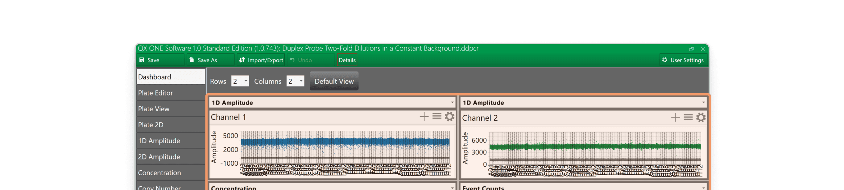
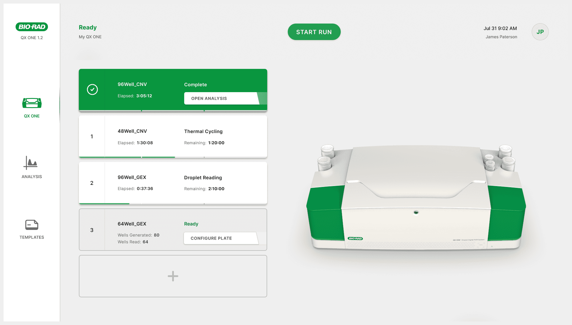
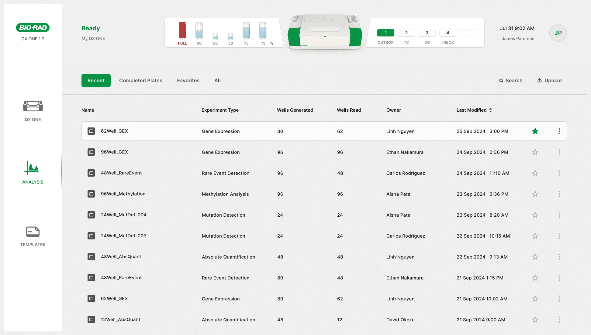
Problem
Start
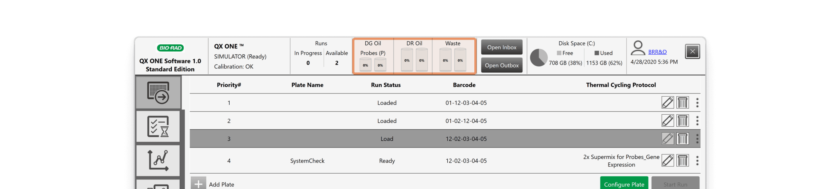
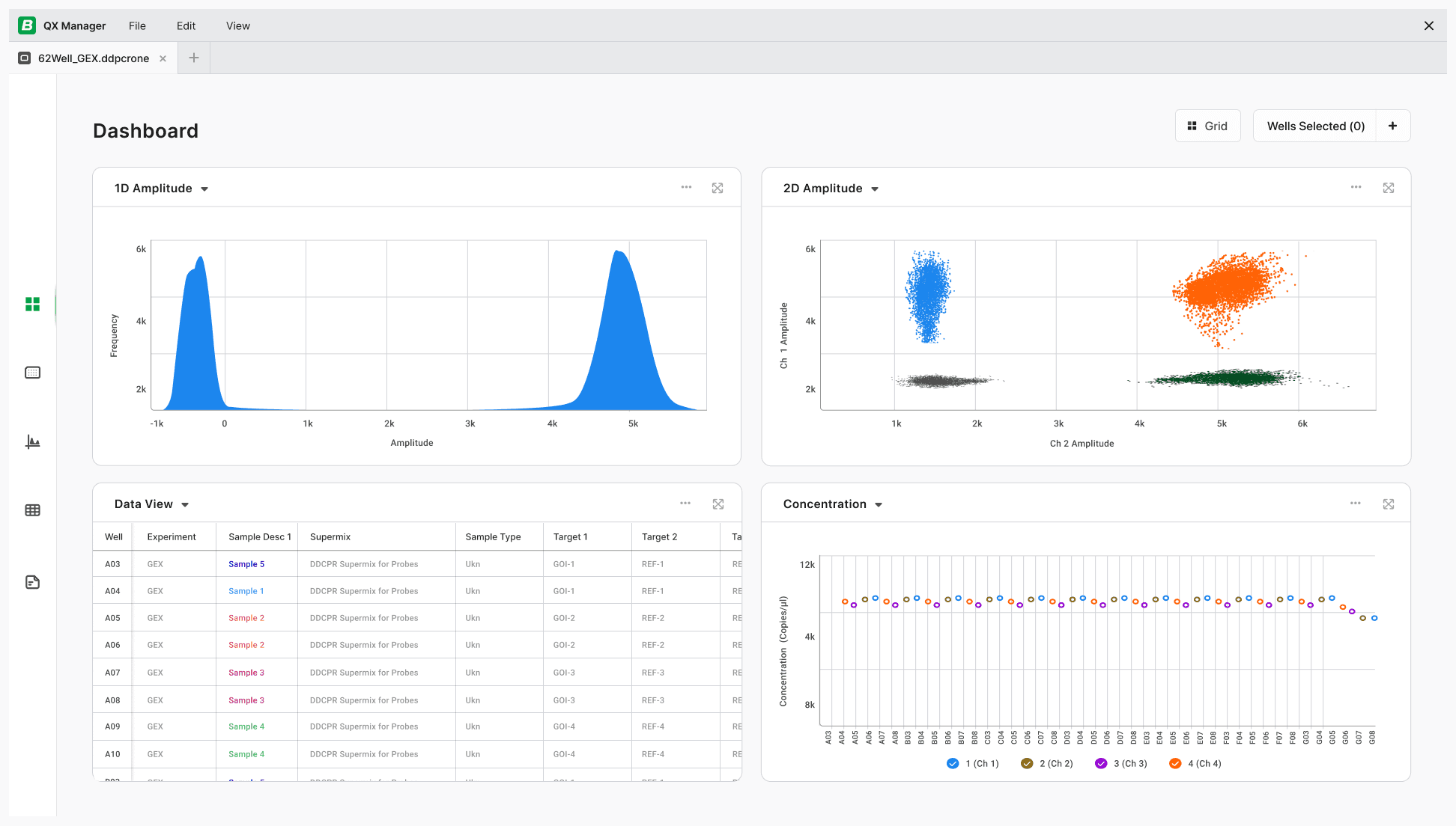
QX One: The 24" touchscreen software on the instrument controls plate setup and data, though rarely used for analysis.
QX Manager: Newer desktop software for data analysis and controlling the QX200 when connected to a computer.
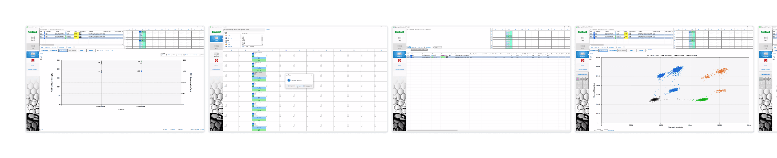
Quantasoft: Older desktop software, preferred by many due to its simplicity.
QX One

QX Manager
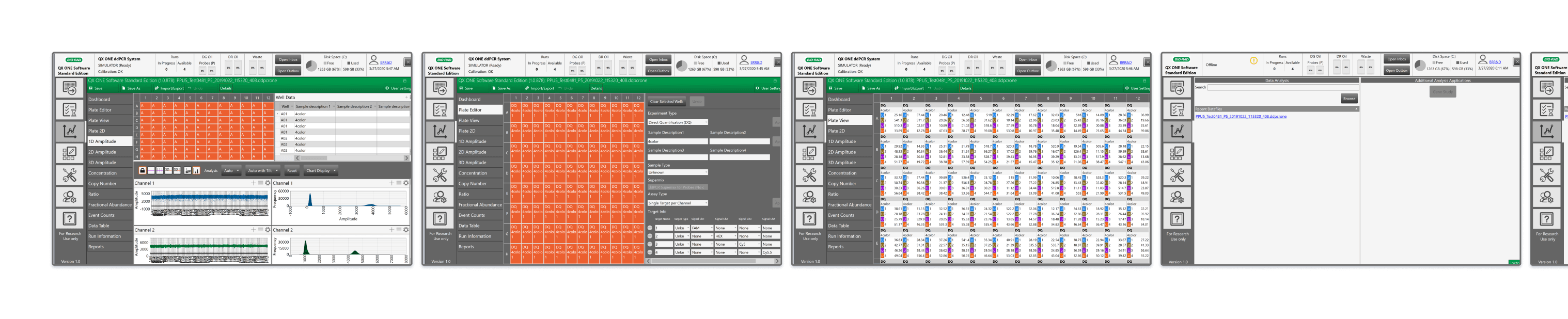
Quantasoft
Start
QX One: The 24" touchscreen software on the instrument controls plate setup and data, though rarely used for analysis.
QX Manager: Newer desktop software for data analysis and controlling the QX200 when connected to a computer.
Quantasoft: Older desktop software, preferred by many due to its simplicity.
QX One
QX Manager
Quantasoft
People
Stakeholders
“You can’t see any information in the wells. There are view issues. The analysis data is too small and hard to use.”
"The current interface is clunky, and could use some streamlining and modernization."
Customers
“The QX Manager is clunky and bare bones.”
“It takes a while to train people on this software. When well data has errors it’s not clear why. The interface isn't easy to use.”
Users
“Printing graphs is too difficult on QX Manager. I am not able to customize what data I want to show for my presentations.”
"When configuring a plate on QX Manager, the apply button doesn't always work."
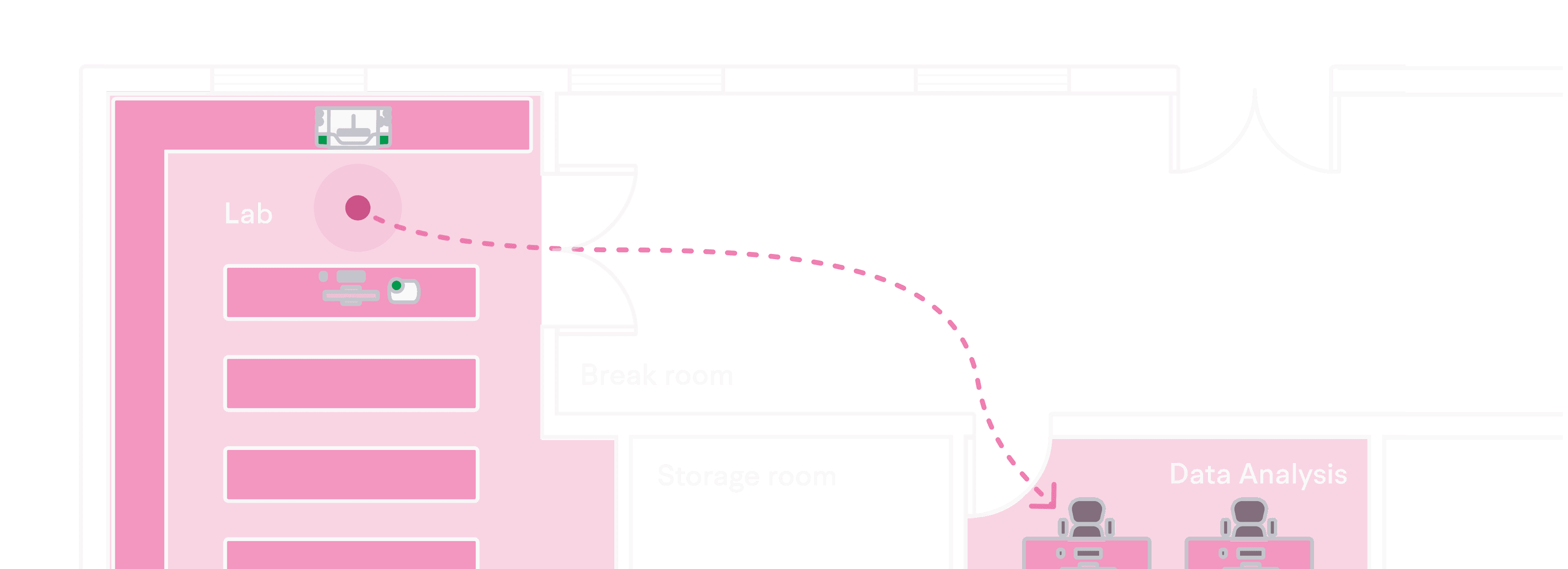
Setting
Interface differences: QX ONE has an embedded touchscreen, while QX200 relies on a monitor, influencing how users interact with each device.
Lab vs desk usage: While the QX ONE and QX200 operate in the lab, detailed analysis and template creation are typically done at desks for greater precision and control.
Line of Sight Considerations
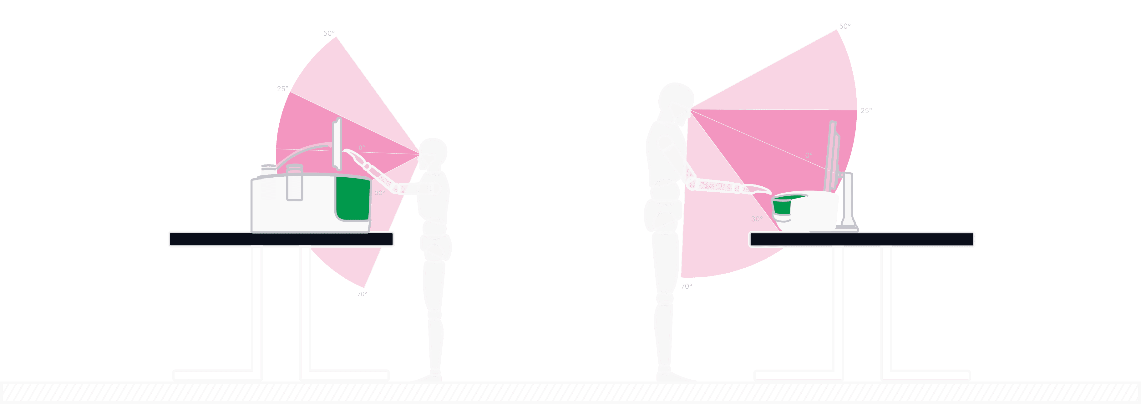
Location Considerations
Setting
Interface differences: QX ONE has an embedded touchscreen, while QX200 relies on a monitor, influencing how users interact with each device.
Lab vs desk usage: While the QX ONE and QX200 operate in the lab, detailed analysis and template creation are typically done at desks for greater precision and control.
Line of Sight Considerations
Location Considerations
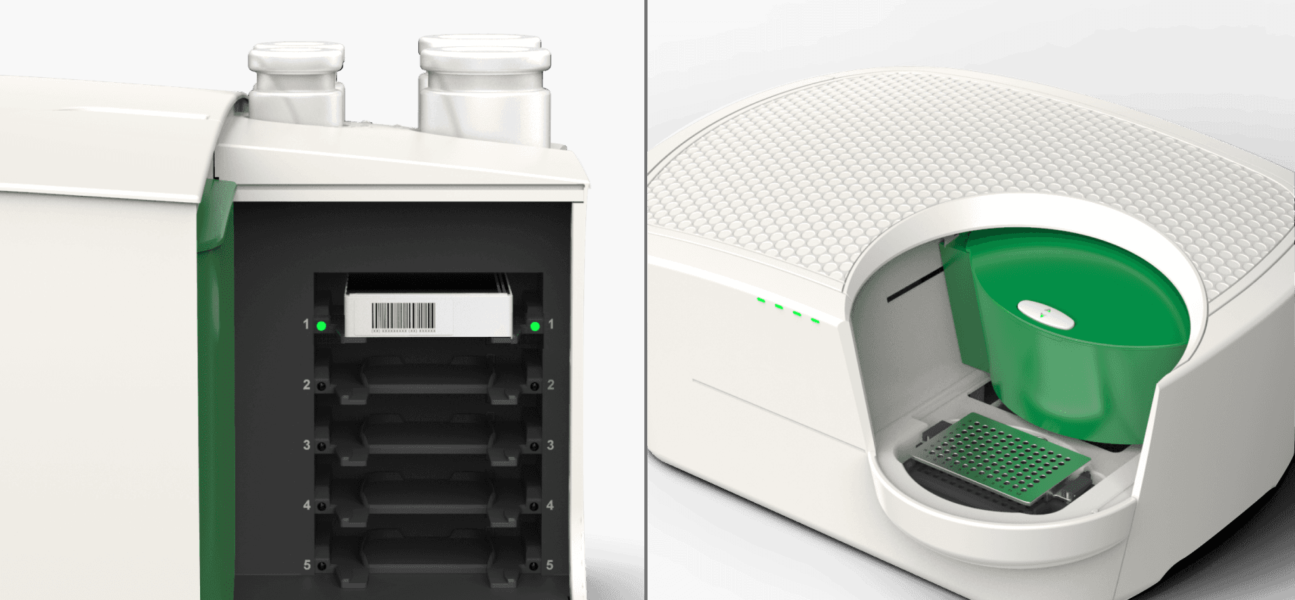
Technology
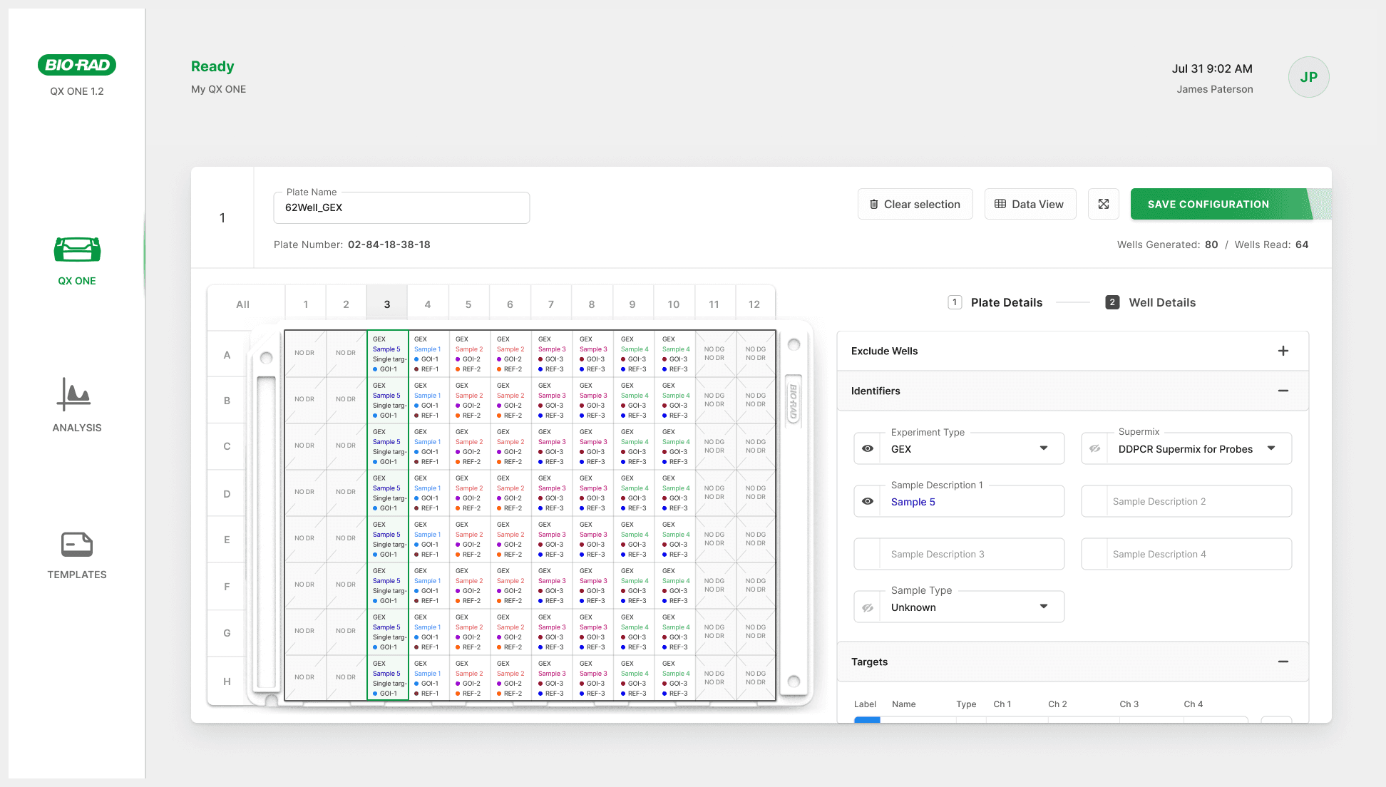
QX One vs QX200 functionality: The QX One supports Droplet Generation, Thermal Cycling and Droplet Reading, while the QX200 handles only Droplet Reading.
5 vs 1 plates: The QX One supports up to five plates; the QX200 only supports one.
Plate scanning Issues: Unclear RFID scan placement on the QX One causes confusion and leads to new user frustration.

Technology
QX One vs QX200 functionality: The QX One supports Droplet Generation, Thermal Cycling and Droplet Reading, while the QX200 handles only Droplet Reading.
5 vs 1 plates: The QX One supports up to five plates; the QX200 only supports one.
Plate scanning Issues: Unclear RFID scan placement on the QX One causes confusion and leads to new user frustration.
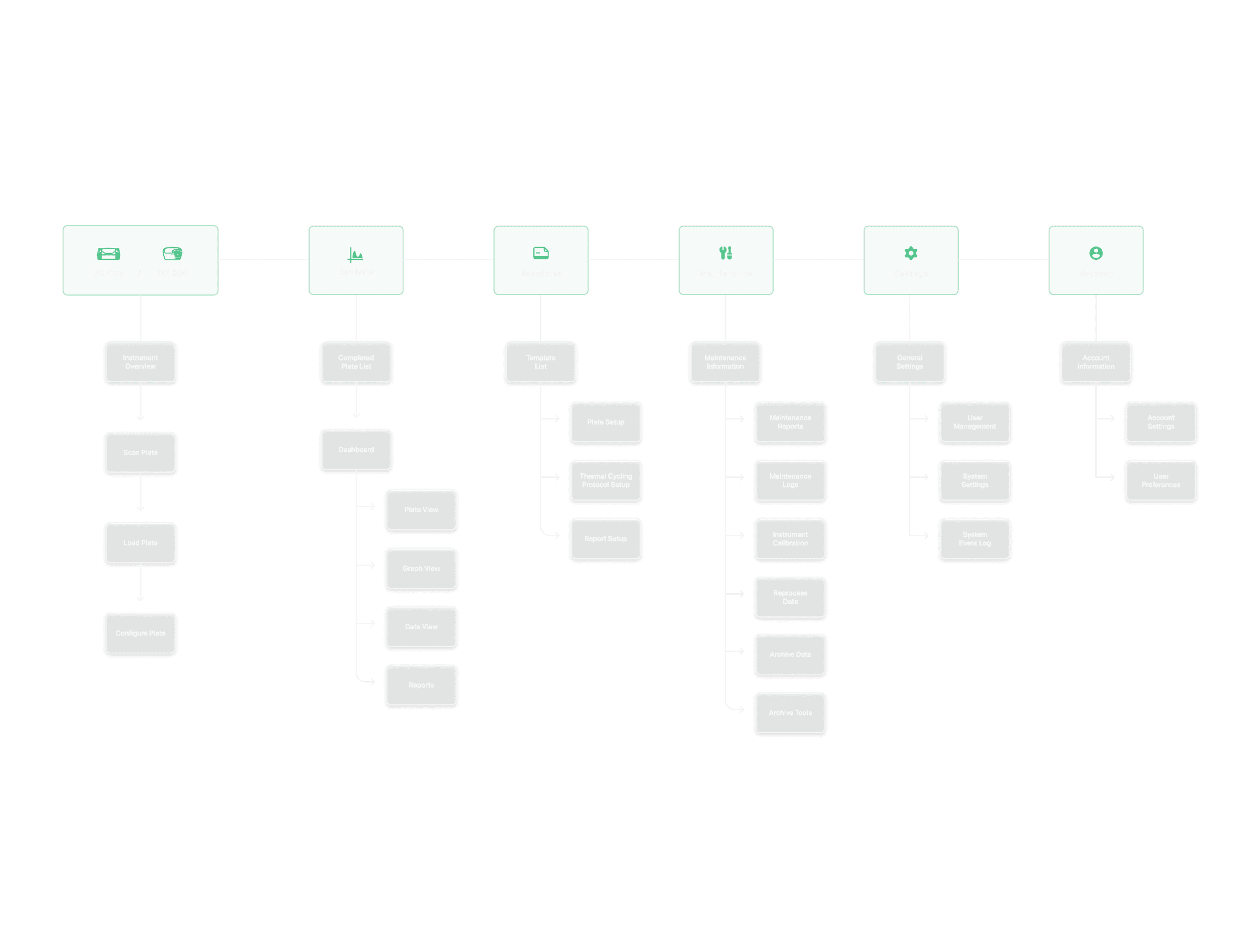
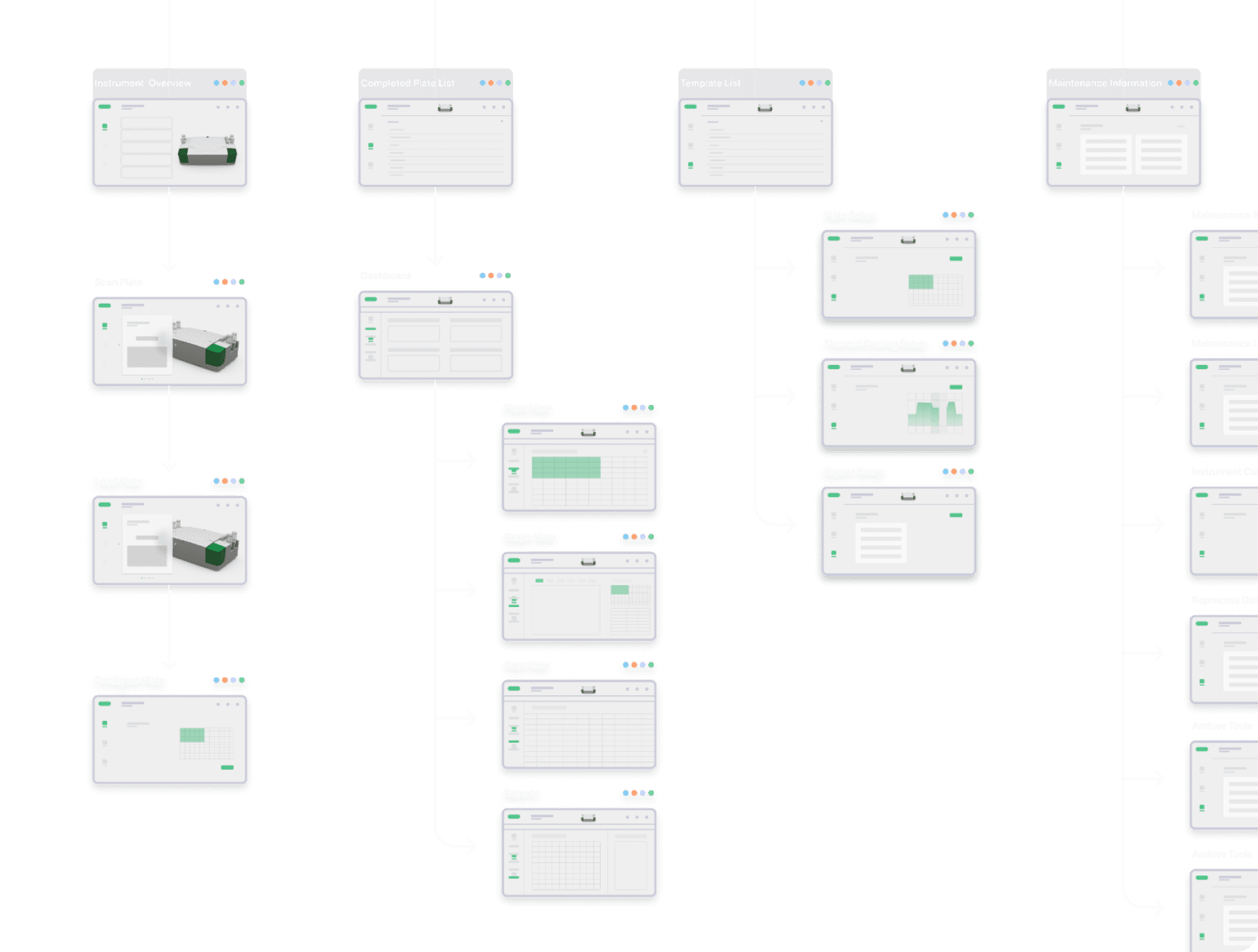
Define
Merging software systems
How might we combine the three legacy systems into a unified platform that works seamlessly across both QX One and QX200?
Plate setup flow
How might we improve plate set up flows so that they support the unique features of both the QX One and QX200 instruments?
Analysis flow
How might we provide analysis features that cater to diverse industry needs, like clinical diagnostics, biopharma and academia?
Discovery
Research
I led three sessions per week with the product owner, engineers and SMEs exploring workflows, pain points and improvements.
Pain points:
• Unclear icons led to failed runs.
• Wells showed limited or irrelevant data.
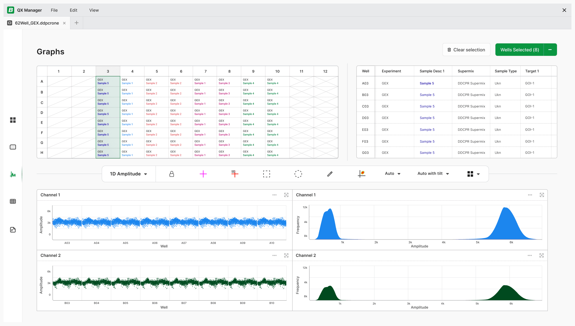
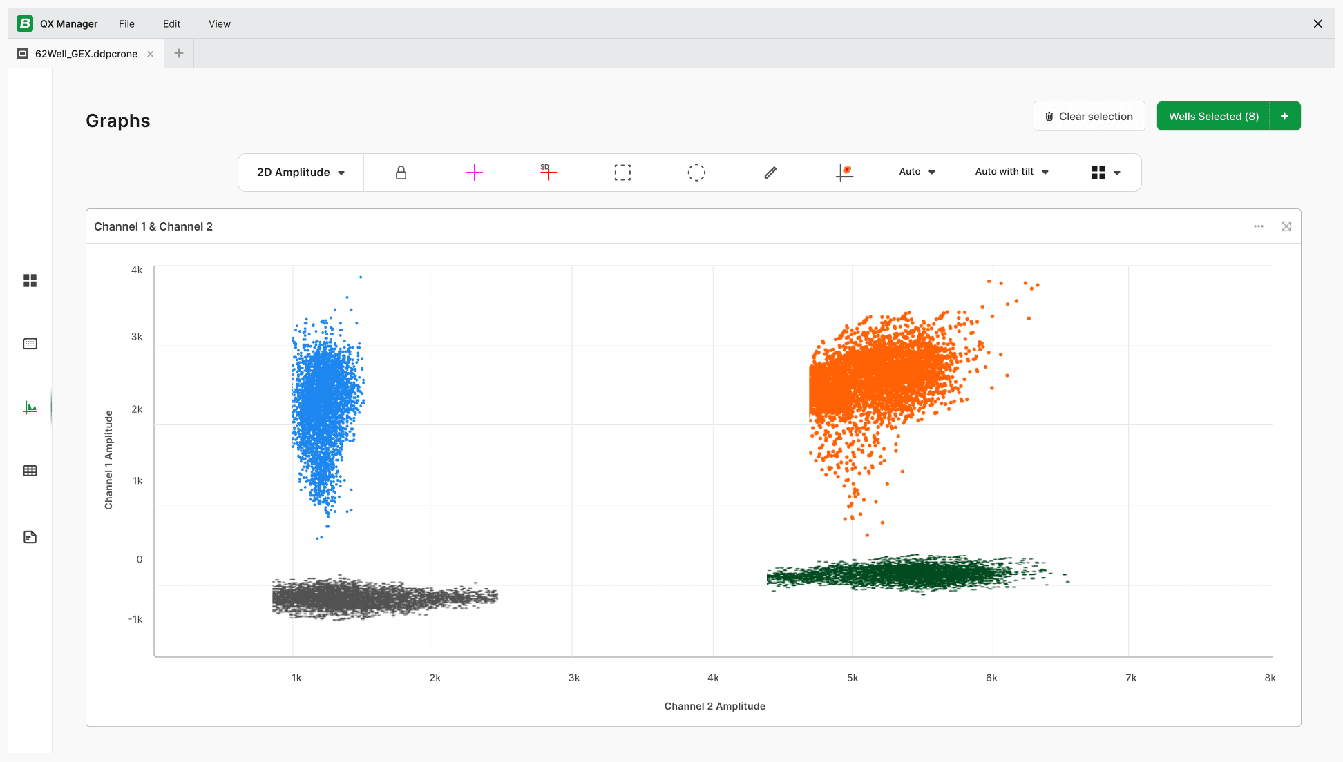
• Complex graphs were difficult to read.
Opportunities:
• Provide clear consumable level visuals.
• Add well data visibility and color controls.
• Include font size and full-screen controls.
Unclear Consumable Icons
Limited Well Data Visible

Unreadable Complex Graphs
Research
I led three sessions per week with the product owner, engineers and SMEs exploring workflows, pain points and improvements.
Pain points:
• Unclear icons led to failed runs.
• Wells showed limited or irrelevant data.
• Complex graphs were difficult to read.
Opportunities:
• Provide clear consumable level visuals.
• Add well data visibility and color controls.
• Include font size and full-screen controls.
Unclear Consumable Icons
Limited Well Data Visible
Unreadable Complex Graphs


Avenues
How can we simplify plate setup?
Clear scanning prompts and plate loading verification would reduce set up errors and avoid incomplete or aborted runs.
How can we improve well selection?
Selectable well data and visually different data types would provide users relevant, useful data and improve analysis accuracy.
How can we maximize data visibility?
Allowing expandable plate and graph views and enabling toggling on/off well selection would improve usability of analysis flows.
Solution


Testing
Methods
Evaluate usability and learnability
Assess how intuitive the new interface is for both new and experienced users.Measure workflow impact
Understand how the interface supports or disrupts real-world workflows.Compare against current workflows
Evaluate performance relative to the existing system on key tasks.
Outcomes
User Feedback
”It’s a huge improvement. Bio-Rad’s software was not as good as the machine. This is the first time I’m seeing quality software that matches the machine. I really like it.”
“The interface is very user friendly. Everything is labeled clearly with its purpose, there is no guess work.”
"It has the ability to be tailored to my needs. It’s extremely powerful."
“Much more streamlined and spaced out nicely. Way less cluttered, I enjoy feeling the space. Much more intuitive.”
"It has all the features I would like."

Self-Reflection
What went well: Strong team alignment
Regular reviews meant strong stakeholder alignment, allowing a smooth integration of new features and approval processes.
Challenges: Solving for diverse needs
Solving for the wide disparity of user needs and instrument functions required frequent feedback and consideration of all workflows.
Lessons: Value of SME collaboration
Subject matter experts provided critical insights, enabling quick, iterative design changes that addressed real-world needs.
For Hiring Managers
© 2026 Allison Ehrke. All rights reserved.
Handmade with ♡ in Aotearoa
For Hiring Managers
© 2026 Allison Ehrke. All rights reserved.
Handmade with ♡ in Aotearoa